Building an Effective IoT Dashboard Using MQTTfy: A Complete Guide to Real-Time Monitoring and Scalable IoT Solutions
February 22, 2026
The Internet of Things (IoT) is transforming industries at an unprecedented pace. From smart homes and industrial automation to healthcare and logistics, IoT devices generate massive volumes of real-time data every second. However, raw data alone has no value unless it is properly structured, visualized, and analyzed. This is where an effective IoT dashboard becomes critical.
An IoT dashboard acts as the command center of your connected ecosystem. It enables real-time IoT monitoring, device management, performance tracking, and intelligent decision-making. In this guide, we will explore how to build an effective MQTTfy Dashboard. For a complete overview of the topic, be sure to read our Ultimate Guide to MQTT Dashboards, which this article expands upon.
What is an IoT Dashboard?
An IoT dashboard is a web-based or cloud-based interface that allows users to monitor, manage, and analyze connected devices in real time. It provides:
- Real-time sensor data visualization
- Device status tracking
- Alerts and notifications
- Historical analytics
- Remote device control
A well-designed IoT analytics dashboard converts complex streams of MQTT messages into intuitive charts, graphs, gauges, and reports.
Without a structured dashboard, IoT systems become chaotic and difficult to manage.
Why MQTT is the Backbone of Modern IoT Dashboards
Before diving into MQTTfy, it is essential to understand why MQTT is widely used in IoT dashboard development.
MQTT (Message Queuing Telemetry Transport) is a lightweight messaging protocol designed for:
- Low bandwidth networks
- High latency environments
- Resource-constrained devices
Its publish-subscribe model ensures efficient and scalable IoT architecture. Devices publish data to topics, and dashboards subscribe to those topics for real-time updates.
Key Benefits of MQTT for IoT Monitoring
- Low overhead communication
- Real-time data streaming
- Reliable message delivery (QoS levels)
- Scalable device management
- Secure communication via TLS
An MQTT dashboard built correctly can handle thousands or even millions of devices simultaneously.
Why Choose MQTTfy for Building an IoT Dashboard?
MQTTfy simplifies IoT dashboard development by providing a streamlined ecosystem for device connectivity, topic management, and data visualization.
Core Advantages of MQTTfy:
- Seamless MQTT broker integration
- Real-time IoT data processing
- Secure authentication and authorization
- Scalable cloud IoT infrastructure
- Customizable dashboard widgets
- Multi-device monitoring capability
Unlike traditional IoT platforms that require complex backend configuration, MQTTfy allows developers to focus on user experience and smart data visualization.
Step-by-Step Guide to Building an Effective IoT Dashboard Using MQTTfy
1. Define Your IoT Use Case and Data Structure
Before designing your dashboard, clearly define:
- What devices are connected?
- What sensors are collecting data?
- What metrics matter most?
- Who will use the dashboard?
For example:
- Smart Home Automation → Temperature, humidity, motion detection
- Industrial IoT Monitoring → Machine uptime, vibration levels, and tracking energy consumption.
- Fleet Management → GPS location, fuel usage, engine diagnostics
- Smart Farming → Soil moisture, weather conditions, crop health.
A structured topic hierarchy improves MQTT dashboard performance:
factory1/machineA/temperature
factory1/machineA/vibration
factory1/machineB/energy
Proper topic design ensures clean IoT data visualization and easy scaling.
2. Connect Devices to MQTTfy Broker
The next step is connecting your IoT devices to the MQTTfy broker.
Devices must:
- Authenticate securely
- Publish telemetry data
- Use appropriate QoS levels
- Implement retain messages when necessary
Best practices:
- Use TLS encryption
- Assign unique client IDs
- Use structured JSON payloads
Example JSON payload:
{
  "temperature": 27.5,
  "humidity": 62,
  "timestamp": "2026-02-16T10:45:00Z"
}
Structured payloads make MQTTfy Dashboard implementation easier.
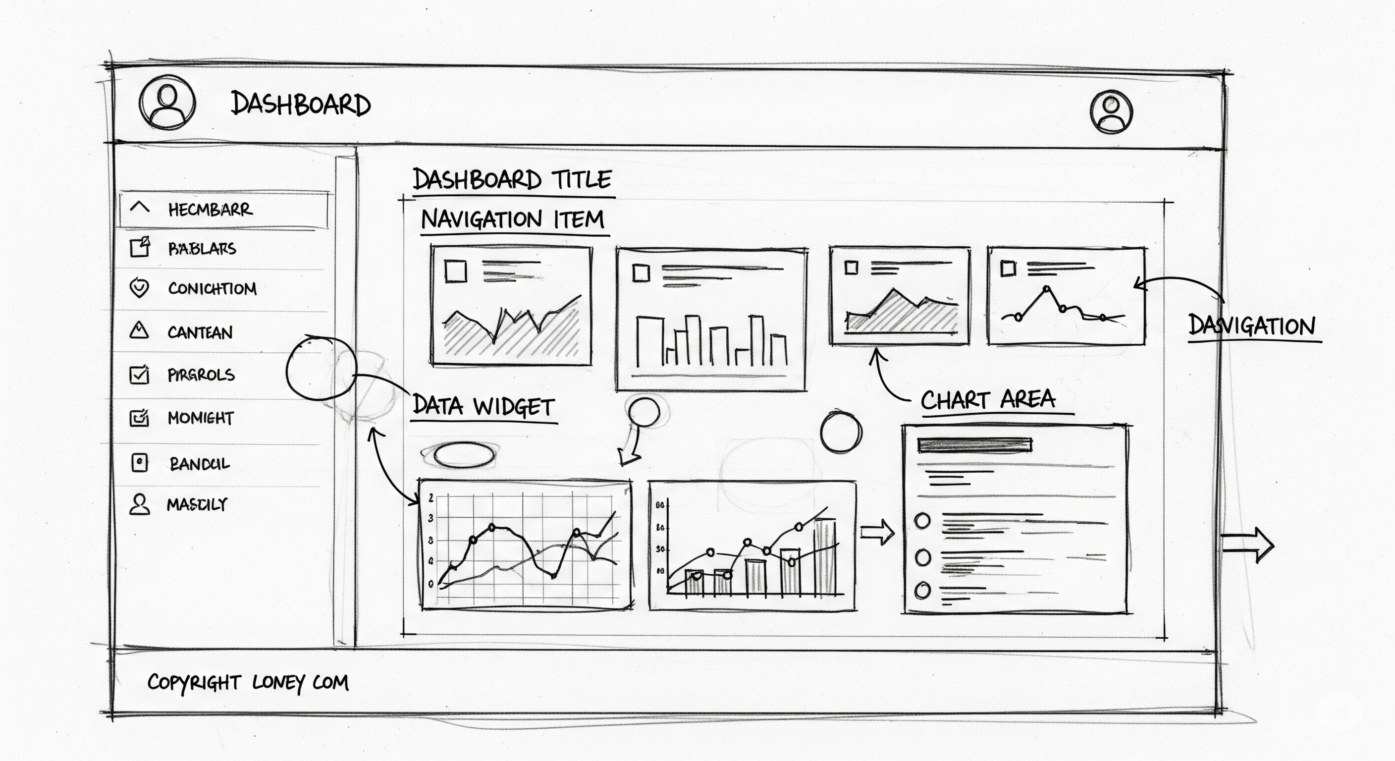
3. Design a Clean and Intuitive Dashboard UI
An effective IoT dashboard is not just about data — it is about clarity.
Essential Dashboard Components:
- Real-time charts
- Line graphs for historical trends
- Gauges for threshold monitoring
- Device status indicators
- Alert notification panel
- Control buttons (if bidirectional control is enabled)
UI Best Practices:
- Use minimal color palette
- Highlight anomalies in red
- Use green for healthy device status
- Avoid cluttered layouts
- Provide dark mode for long-term monitoring
User experience plays a critical role in smart device monitoring efficiency.
4. Implement Real-Time Data Visualization
Real-time IoT monitoring requires efficient WebSocket or MQTT over Web support. Mastering IoT data visualization is a discipline in itself, but some effective techniques include:
When a device publishes data, your MQTTfy Dashboard should:
- Receive message instantly
- Parse JSON payload
- Update widget dynamically
- Store data in database (optional)
| Data Purpose | Best Widget Choice(s) | Why? |
|---|---|---|
| Current state vs. a range | Gauge, Temperature Bar | Instantly shows where a single value lies within an expected range. |
| Binary status | LED Indicator, Text Status | The clearest way to show on/off, good/fault, online/offline. |
| Trend over time | Line Chart | The human eye is excellent at detecting patterns and anomalies in a line. |
| Comparison of categories | Bar Chart | Best for comparing discrete values, like the output of multiple machines. |
| Geographical location | Map | The only choice for visualizing data that has a physical location. |
| Precise, detailed logs | Table | For when exact values and timestamps matter more than at-a-glance trends. |
Effective IoT data visualization techniques include:
- Time-series charts
- Heatmaps
- Multi-axis graphs
- Live event streams
The faster your dashboard updates, the more valuable it becomes for operations teams. One powerful technique is streaming video, for instance with a camera widget from a Raspberry Pi, to add visual verification to your data.
5. Add Historical Data and IoT Analytics
Real-time monitoring is only one part of the solution. Historical analytics transforms raw data into actionable insights.
Integrate:
- Time-series databases
- Data retention policies
- Aggregation rules
- Statistical computation
Examples of IoT analytics:
- Average temperature per day
- Energy usage trends
- Predictive maintenance indicators
- Anomaly detection
With MQTTfy, combining real-time streaming with stored historical data creates a powerful IoT analytics dashboard.
6. Implement Alerts and Threshold-Based Automation
An effective IoT dashboard should proactively notify users.
Examples:
- Temperature > 80°C → Send alert
- Vibration spike → Trigger maintenance ticket
- Device offline → Notify admin
Alert mechanisms:
- Email notifications
- SMS alerts
- In-app notifications
- Webhook integrations
Smart alerting improves operational efficiency and reduces downtime, a key goal in applications like aquaculture and environmental monitoring.
7. Ensure Security and Access Control
Security is critical in any cloud IoT platform.
Best practices include:
- Role-based access control (RBAC)
- Topic-level permissions
- Encrypted connections (TLS)
- Strong password policies
- Token-based authentication
For enterprise MQTTfy Dashboard development, always implement multi-layered security.
8. Optimize for Scalability
As your IoT deployment grows, your dashboard must scale.
Scalability considerations:
- Load-balanced MQTT broker clusters
- Horizontal scaling of backend servers
- Efficient topic namespace design
- Caching frequently accessed data
- Database partitioning
MQTTfy’s scalable IoT architecture ensures your dashboard handles growth without performance degradation, whether for a smart city project or analyzing retail analytics.
Common Mistakes to Avoid in IoT Dashboard Development
- Overloading dashboard with too many widgets
- Poor topic naming structure
- Ignoring security configuration
- Not implementing QoS properly
- Lack of historical data storage
- No alerting mechanism
- Designing for desktop only (ignore mobile users)
A minimal, purpose-driven design always performs better.
Advanced Features to Enhance Your MQTT Dashboard
To make your IoT dashboard more powerful, consider implementing:
- Role-Based Dashboards: Different users see different data.
- Multi-Tenant Architecture: Serve multiple clients from a single cloud IoT platform.
- Predictive Analytics: Machine learning-based anomaly detection.
- Remote Device Control: Send MQTT commands back to devices.
- Data Export and Reporting: Generate CSV or PDF reports.
- Edge Processing Integration: Pre-process data before sending to MQTT broker.
These features significantly enhance MQTTfy Dashboard value proposition.
Performance Optimization Tips for High-Traffic IoT Dashboards
If you aim to handle thousands of devices:
- Use message batching
- Implement message throttling
- Compress payloads
- Avoid unnecessary retained messages
- Implement lazy loading for dashboard widgets
Performance tuning ensures smooth real-time IoT monitoring.
Final Thoughts: Why MQTTfy is the Future of IoT Dashboards
Building an effective IoT dashboard requires a combination of:
- Reliable MQTT communication
- Real-time data visualization
- Scalable backend infrastructure
- Secure device authentication
- Intelligent analytics
MQTTfy simplifies the entire MQTTfy Dashboard development lifecycle by offering a streamlined MQTT ecosystem built for performance and scalability.
Whether you are developing:
- A smart home dashboard
- An industrial IoT monitoring system
- A fleet management tracking platform
- A healthcare IoT analytics solution
MQTTfy provides the foundation needed to build secure, scalable, and high-performance IoT dashboards.
Conclusion
The future of connected technology depends on intelligent data visualization and actionable insights. An effective MQTT dashboard transforms IoT data streams into meaningful business intelligence.
By using MQTTfy, developers can build:
- Real-time IoT monitoring systems
- Scalable IoT architectures
- Secure MQTT-based dashboards
- Advanced IoT analytics platforms
In the evolving world of smart devices and connected ecosystems, a powerful IoT dashboard is not optional — it is essential.
If you are planning your next IoT project, start with an MQTTfy Dashboard and design a dashboard that is not just functional, but transformational.
Frequently Asked Questions
What is the most common mistake when designing an IoT dashboard?
The most common mistake is information overload. Many designers try to display every possible piece of data on a single screen without a clear hierarchy or purpose. This creates a cluttered, confusing interface where it is impossible to quickly identify the most critical information. The key is to start by defining the user's primary goal and then showing only the data necessary to achieve that goal, with options to drill down for more detail.
What is the 'three-second rule' for dashboards?
The 'three-second rule' is a design guideline stating that any user, especially an operator, should be able to understand the overall status of their system within three seconds of looking at the dashboard. This is achieved through clear, high-contrast visual cues like color-coded gauges (green for normal, red for alarm), large summary KPIs, and a clean, uncluttered layout.
What is a 'headless' IoT device in the context of a dashboard?
A headless IoT device is a piece of hardware (like a Raspberry Pi or an industrial sensor) that operates without its own screen or user interface. The dashboard becomes the 'head' for the device, providing the essential user interface for monitoring its status, viewing its data, and sending it commands. The entire MQTT architecture is designed to enable this separation.
How can I make my dashboard 'actionable'?
An actionable dashboard goes beyond just displaying data; it allows you to control the system. This is done by adding control widgets like Buttons, Toggles, and Sliders. For example, next to a gauge showing a tank is full, you can place a button that sends an MQTT command to .../pump/set with the payload 'OFF'. This closes the loop between insight and action.
Should I combine operational data and analytical data on one screen?
It's generally better to separate them. An operational dashboard is for real-time, at-a-glance monitoring (e.g., current machine status). An analytical dashboard is for deep-dive exploration of historical data (e.g., trend analysis, root cause investigation). Trying to serve both purposes on a single screen often leads to a compromised design that does neither well. A better approach is to have a main operational screen with links or drill-downs to more detailed analytical pages.