Case Study: IoT Retail Analytics for Smart Stores
February 22, 2026
Retail is no longer just about shelves and billing counters. Modern retail operations rely heavily on real-time analytics, in-store behavior tracking, inventory visibility, energy monitoring, and automated alerts. This article is a detailed cluster page supporting our main MQTT Dashboard guide.
In this case study, we explore how a multi-location retail chain implemented a BLE + MQTT-based analytics architecture using the MQTTfy Dashboard to gain operational visibility and increase profitability.
1️⃣ Company Background
Business Overview
- Industry: Electronics & Lifestyle Retail
- Store Count: 38 stores across 5 cities
- Average Footfall: 900–1500 visitors per store per day
- SKU Count: 12,000+ products
- Warehouses: 3 regional hubs
The company faced multiple operational blind spots:
- No real-time shelf inventory tracking
- Inaccurate footfall analytics
- Delayed restocking alerts
- Manual energy consumption monitoring
- Poor correlation between customer traffic and sales conversion
They needed a scalable system that:
- Provides real-time store intelligence
- Supports multiple branches
- Minimizes hardware costs
- Works with cloud dashboards
- Offers centralized visibility
2️⃣ Why MQTT + BLE for Retail Analytics?
Retail stores are dynamic environments with:
- Multiple floors
- High device density
- Wireless interference
- Constant layout changes
Traditional wired systems were:
- Expensive
- Difficult to reconfigure
- Not scalable
Instead, the team selected:
- MQTT for messaging
- Bluetooth Low Energy for in-store sensor communication
Why MQTT?
- Lightweight
- Publish/Subscribe architecture
- Ideal for real-time analytics
- Reliable delivery via QoS
- Easy horizontal scaling
Why BLE?
- Low power
- Battery-operated beacons
- Easy installation
- No major rewiring
- Cost-effective deployment
3️⃣ Retail Analytics Architecture
System Overview
Architecture Layers
-
Sensor Layer
Installed devices:
- BLE Beacons for footfall tracking
- Shelf weight sensors
- Temperature sensors (cold storage)
- Energy meters
- Smart door counters
Each device broadcasts data periodically.
-
Gateway Layer
In-store gateways:
- Scan BLE signals
- Aggregate local sensor data
- Convert raw payload to structured JSON
- Publish to MQTT broker
Gateways used edge processing for:
- Footfall counting
- Noise filtering
- Duplicate detection
-
MQTT Broker Layer
Centralized cloud MQTT broker cluster:
- Secure TLS communication
- Multi-store topic isolation
- ACL-based store access
- Persistent message storage
Topic structure example:
retailco/store12/footfall/hourlyretailco/store12/shelfA3/stockretailco/store12/energy/consumption -
MQTTfy Dashboard Layer
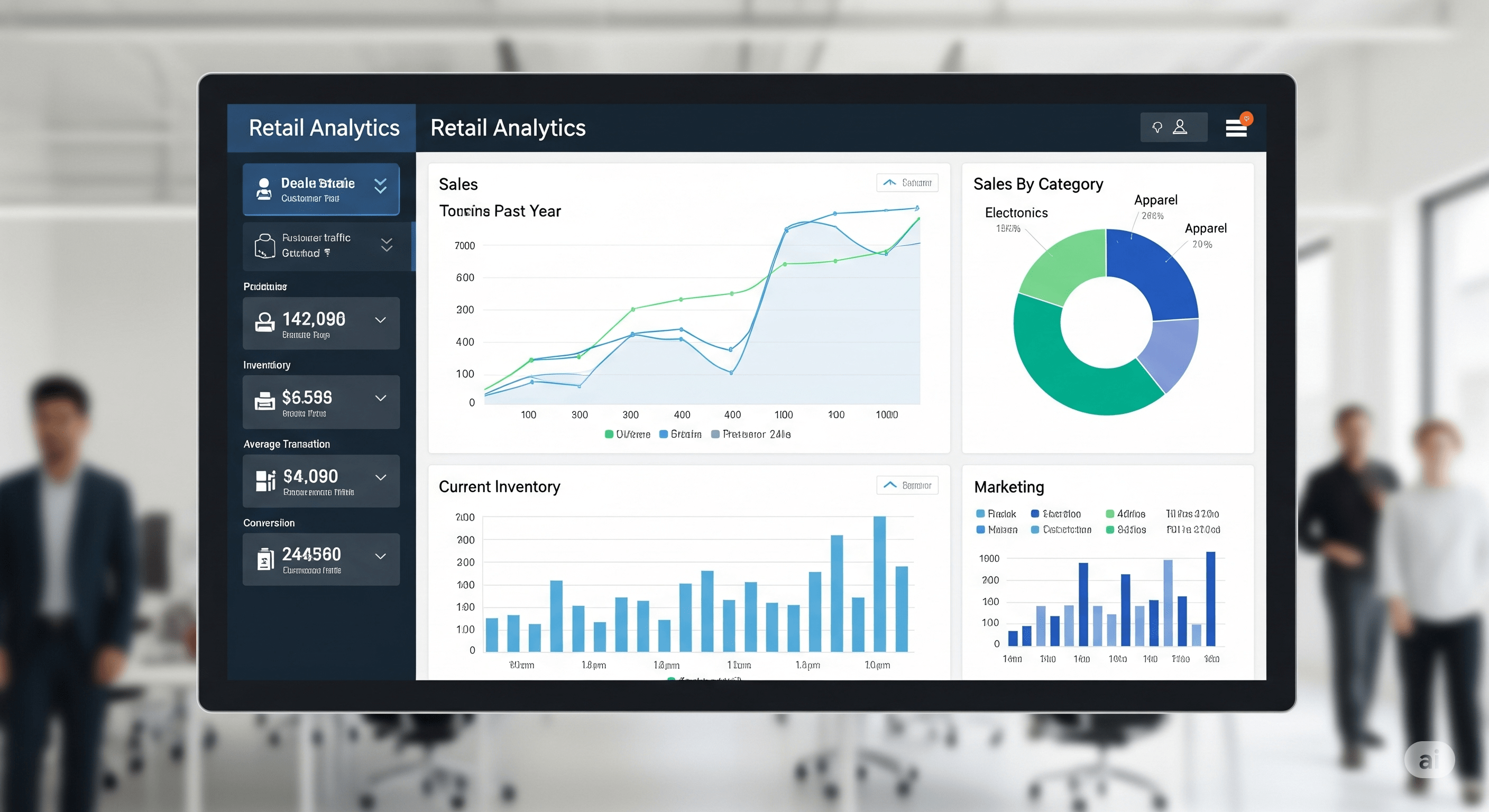
All analytics visualized via MQTTfy Dashboard:
- Live footfall graphs
- Heatmap analytics
- Inventory alerts
- Store comparison reports
- Energy usage analytics
- Sales correlation charts
This directly strengthens the MQTTfy Dashboard pillar content by showing real-world use.
4️⃣ Use Case 1 – Footfall Analytics
The Problem
Store managers estimated footfall manually. Inaccuracies ranged from 15–30%. This affected:
- Staffing decisions
- Promotional planning
- Store layout strategy
The Solution
BLE beacons installed at:
- Entry points
- High-value product sections
- Billing counters
Gateways processed beacon signals and:
- Counted unique device entries
- Tracked dwell time
- Generated hourly reports
Results
| Metric | Before | After |
|---|---|---|
| Average Estimated Footfall | 1100/day | - |
| Actual Average Footfall | - | 1325/day |
Insights discovered:
- 40% visitors stayed <7 minutes
- Peak time: 6 PM – 9 PM
- Conversion rate highest between 11 AM – 1 PM
This allowed management to:
- Optimize staffing
- Reschedule promotions
- Redesign display layouts
Revenue increased by 11% in 4 months.
5️⃣ Use Case 2 – Smart Shelf Monitoring
The Problem
High-demand items frequently went out of stock during peak hours. Losses due to stockouts: ₹7–9 lakhs/month. This is a common issue that our industrial monitoring solutions also address.
Implementation
Weight sensors under key product shelves:
- Real-time stock threshold detection
- MQTT alert triggers when weight < defined limit
- MQTTfy Dashboard notification for restocking
Topic Example: retailco/store08/shelfC2/stocklevel
Results
- Stockout incidents reduced by 68%
- Real-time restocking alerts
- Improved product availability
- Sales uplift of 6.4%
6️⃣ Use Case 3 – Energy Analytics
Retail stores consume high energy due to:
- Lighting
- Air conditioning
- Refrigeration
- Display units
Energy meters integrated into MQTT network. The dashboard displayed, similar to our energy management case study:
- Hourly consumption
- Store-wise comparison
- Peak usage alerts
- Off-hour anomaly detection
Results
- Identified 3 stores with abnormal nighttime energy usage
- Reduced electricity cost by 14%
- Automated AC shutdown alerts implemented
7️⃣ Data Modeling & Topic Hierarchy
Poor topic hierarchy causes chaos in multi-store environments. They adopted structured format: company/store/section/device/metric
Example: retailco/store21/entrance/footfall/count
Benefits:
- Easy filtering
- Multi-tenant store separation
- Simplified dashboard mapping
- Scalability for 100+ stores, a challenge also seen in smart city projects.
Payload example:
{
  "timestamp": 1707501122,
  "value": 324,
  "unit": "count"
}
8️⃣ Real-Time Dashboard Features
Using MQTTfy Dashboard, they implemented a dashboard based on the principles of building an effective IoT dashboard:
- Live KPI panels
- Multi-store comparison view
- Heatmaps
- Historical trend overlays
- Mobile-responsive interface
- Role-based access (Store vs Head Office)
The head office dashboard showed:
- All 38 stores in one grid
- Color-coded performance indicators
- Real-time alerts
9️⃣ Security in Retail IoT
Retail networks are vulnerable to:
- Public Wi-Fi interference
- Device spoofing
- Unauthorized access
Security layers implemented:
| Layer | Implementation |
|---|---|
| Transport Security | TLS encryption, Broker certificate validation |
| Device Authentication | Unique client ID per gateway, Token-based authentication |
| Topic Access Control | Store-level isolation, Read-only dashboards for managers |
No breach recorded since deployment.
1️⃣0️⃣ Deployment Timeline
- Phase 1 – Pilot (5 stores)
- Duration: 30 days
- 120 sensors installed
- Data validation
- Phase 2 – Scale to 38 stores
- 760 sensors
- 38 gateways
- Centralized broker cluster
- Completed in 10 weeks
1️⃣1️⃣ Financial Impact
- Initial Investment: ₹42 lakhs
- Annual Savings:
- Energy optimization: ₹18 lakhs
- Reduced stockout losses: ₹55 lakhs
- Increased revenue: ₹1.2 crore uplift
- ROI achieved within 8 months.
1️⃣2️⃣ Scalability Blueprint
Future plans:
- AI-based conversion prediction
- Smart queue management with camera widgets
- Customer behavior heatmaps with better data visualization
- Dynamic pricing engine
- Multi-country expansion
Architecture supports:
- 10,000+ devices
- 200+ stores
- 500K+ MQTT messages/hour
1️⃣3️⃣ Lessons Learned
- Always start with pilot store, a good practice for any project, including fleet management.
- Design topic structure before deployment
- Use edge filtering to reduce noise
- Monitor gateway uptime
- Integrate sales POS data with MQTT topics
- Design dashboards for business users, not engineers
1️⃣4️⃣ Why Retail Analytics Needs MQTTfy Dashboard
Retail analytics requires:
- Real-time processing
- Store isolation
- Central visibility
- Flexible dashboards
- Scalable architecture
The MQTTfy Dashboard serves as:
- Visualization engine
- Alerting system
- Operational intelligence layer
- Multi-store management console
1️⃣5️⃣ Conclusion
Retail is moving toward intelligent, data-driven environments. This case study proves that combining:
- BLE sensors
- MQTT messaging
- Cloud broker infrastructure
- MQTTfy Dashboard visualization
can:
- Increase revenue
- Reduce operational losses
- Optimize energy usage
- Improve customer experience
- Provide centralized store intelligence
Retail analytics powered by MQTT is not experimental — it is commercially viable, scalable, and ROI-positive.
Frequently Asked Questions
How can IoT sensors measure store foot traffic?
The simplest method is an infrared (IR) beam sensor at the entrance. Every time the beam is broken, it sends an MQTT message, allowing a dashboard to count entries. More advanced methods use ceiling-mounted 3D depth-sensing cameras or Wi-Fi analytics to get highly accurate counts of people entering, exiting, and even their paths within the store.
What is Point-of-Sale (PoS) integration?
PoS integration involves capturing data from your cash register or payment processing system. When a transaction occurs, the PoS system publishes an MQTT message with details like the transaction amount and items purchased. By combining this with foot traffic data, you can calculate real-time conversion rates (sales / visitors).
How can I measure queue length at checkout?
This is a prime use case for computer vision. A small camera overlooking the checkout area can run an AI model that counts the number of people in the queue. It then publishes this number periodically to an MQTT topic like 'store/location-1/checkout/queue/state'. The dashboard can then alert a manager if the queue exceeds a certain threshold, prompting them to open a new register.
What is a customer heat map in a retail context?
A customer heat map is a visual representation of where customers spend the most time in your store. It's created by aggregating data from presence sensors (like PIR) or video analytics over time. The 'hot' areas on the map are your most popular zones, which is invaluable information for product placement and store layout design.
Is it difficult to scale this technology across multiple store locations?
MQTT makes scaling surprisingly manageable. By using a well-designed topic structure that includes the store ID (e.g., 'retail/store-102/entrance/count'), you can send data from hundreds of stores to the same central MQTT broker. A master dashboard can then aggregate KPIs from all stores, while individual store managers can have views filtered to their specific location.